I've been working in ecommerce, web development, and digital marketing for more than 25 years, helping businesses across Canada and the United States improve how they attract customers and sell online.
During that time, ecommerce technology has changed dramatically. I've watched websites evolve from simple online catalogues into sophisticated Shopify stores, personalized shopping experiences, and complex digital sales channels.
But one thing hasn't changed:
Small amounts of friction can have a surprisingly large impact on ecommerce sales.
A store can have great products, competitive pricing, strong advertising, and thousands of monthly visitors—and still underperform because the website makes buying unnecessarily difficult.
And the opportunity is substantial.
According to Shopify, global ecommerce conversion rates vary considerably by industry. Recent benchmarks range from around 0.94% for luxury and jewelry to 6.22% for food and beverage, with categories such as home and furniture averaging around 1.41%.
That means you shouldn't obsess over achieving some universal "good conversion rate." Instead, you should ask:
How many more of the visitors I'm already paying to attract could I convert?
If your store gets 100,000 visitors per month, moving from a 1.5% conversion rate to 1.8% represents 300 additional orders—without increasing traffic.
That's why I view ecommerce web design as much more than aesthetics.
Your website is a sales system.
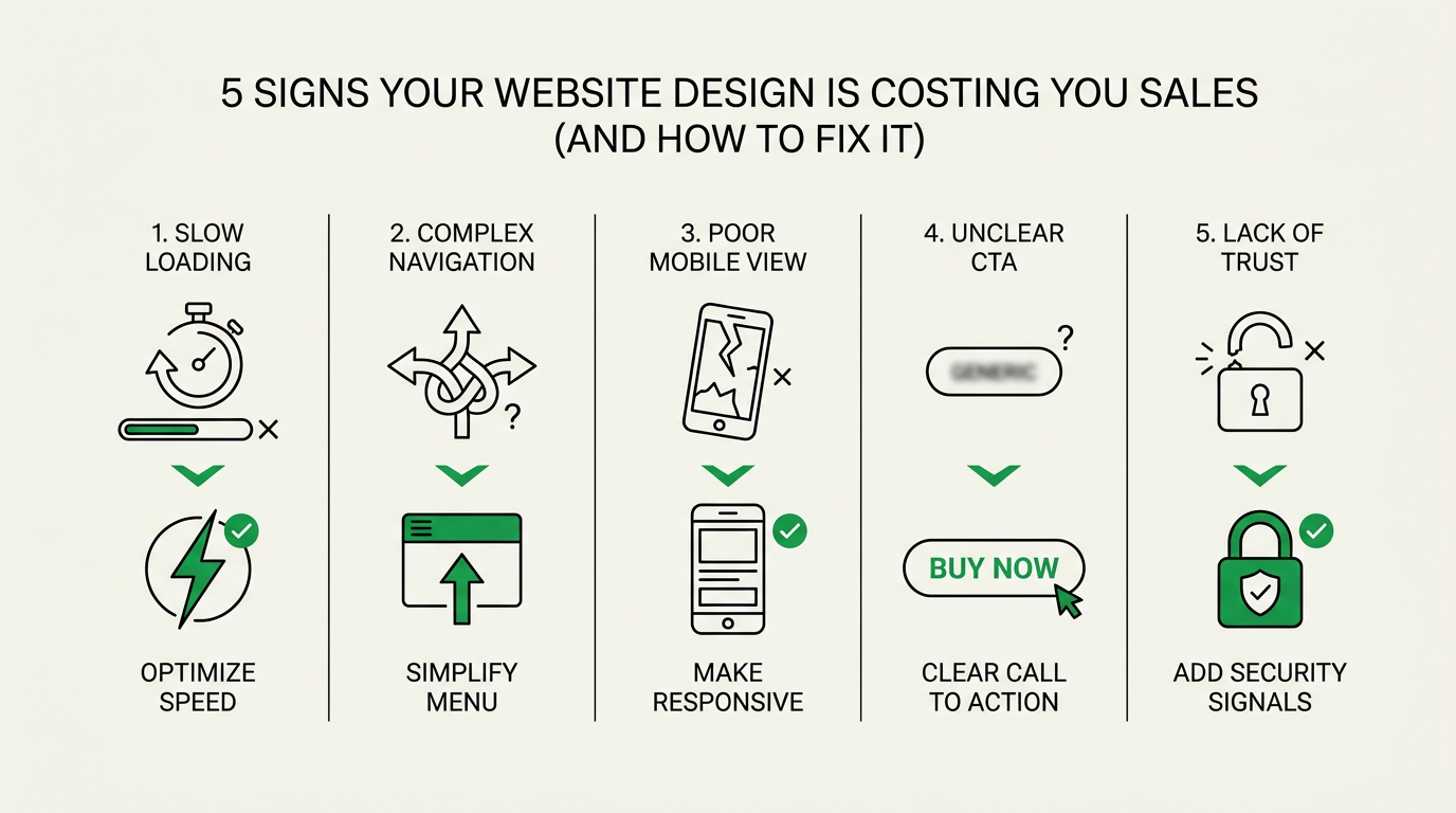
Here are five of the most common ecommerce design mistakes I see—and what I recommend doing about them.
1. Your Website Is Too Slow
The Problem
Site speed is one of the first things I look at when evaluating an ecommerce website.
You can create beautiful photography, sophisticated animations, promotional banners, product videos, recommendation engines, reviews, pop-ups, personalization tools, and tracking scripts.
But every addition comes with a potential performance cost.
And customers don't care how impressive your technology stack is if they're waiting for the page to load.
Recent Shopify data illustrates just how important performance can be. In a 2026 analysis of active stores, Shopify found that for every additional 100 milliseconds of loading time, conversion rates tended to be approximately 3.5% lower.
That's why speed optimization shouldn't be treated purely as an IT task.
It's a conversion optimization task.
The Fix
Start by looking at what's making your important pages heavy.
I generally recommend focusing on:
- Compressing and properly sizing images. Don't serve a massive desktop image to someone browsing on a smartphone.
- Using modern image formats. Formats such as WebP and AVIF can substantially reduce image file sizes.
- Reviewing third-party apps. Ecommerce stores often accumulate apps, pixels, widgets, pop-ups, review tools, personalization scripts, and tracking software over time.
- Lazy-loading content. Images and other resources further down the page don't necessarily need to load immediately.
- Reducing unnecessary JavaScript. Too much client-side code can make an otherwise attractive store feel sluggish.
- Monitoring Core Web Vitals. Pay attention to Google's measurements for loading performance, responsiveness, and visual stability.
- Testing actual mobile performance. Your website may feel fast on your office Wi-Fi and still perform poorly for customers using cellular connections.
One mistake I frequently see is a merchant redesigning an entire website when the real issue is performance.
Before rebuilding, diagnose.
Sometimes removing unnecessary apps, optimizing images, simplifying scripts, and cleaning up theme code can produce a meaningful improvement without changing the visual design at all.
2. Your Navigation Makes Customers Think Too Much
The Problem
Your navigation shouldn't reflect how your company organizes its inventory internally.
It should reflect how customers shop.
That's a subtle but important distinction.
I've seen ecommerce websites with technically logical navigation structures that were still difficult for customers to use.
Why?
Because the merchant understood the categories perfectly—but the customer didn't.
Baymard Institute's ecommerce usability research consistently demonstrates how widespread this problem remains. Its 2025 benchmark found that 58% of desktop ecommerce sites and 67% of mobile sites had "mediocre" to "poor" homepage and category navigation UX.
If shoppers can't easily understand where to go, some will simply leave.
The Fix
I recommend evaluating your navigation from the perspective of someone who has never visited your store before.
Ask yourself:
If I landed here knowing what type of product I wanted—but not its exact name—could I find it within a few seconds?
Good ecommerce navigation usually means:
- Using customer-friendly category names
- Keeping the main navigation focused
- Creating logical subcategories for larger catalogues
- Providing useful filtering and sorting
- Using breadcrumbs so shoppers understand where they are
- Making important categories easy to reach on mobile
- Providing prominent site search
- Allowing shoppers to browse by the attributes that actually matter to them
For example, someone shopping for furniture may want to browse by room, product type, material, style, colour, dimensions, or price.
Someone buying automotive products might care about year, make, model, compatibility, finish, and specifications.
Your site's information architecture should mirror the customer's decision-making process.
Don't Ignore Search
Site search deserves special attention.
Baymard's ecommerce search research has found that roughly half of users prefer search as their primary product-finding method, while the other half primarily navigate through categories.
For stores with hundreds or thousands of SKUs, improving search can be one of the highest-impact UX projects you undertake.
Search should tolerate:
- Misspellings
- Synonyms
- Product attributes
- Model numbers
- Categories
- Brands
- Common customer terminology
Remember:
If customers can't find a product, they can't buy it.
3. Your Product Pages Don't Answer Enough Questions
The Problem
I consider the product page one of the most important pages on an ecommerce website.
Your homepage introduces the business.
Your category pages help customers browse.
But your product page often has to close the sale.
Baymard's Product Page UX research found that more than half of ecommerce sites provide a "mediocre or worse" product-page experience.
That's a major opportunity.
A common mistake I see is designing product pages around what the merchant wants to say rather than what the customer needs to know.
A customer evaluating a product may be asking:
Is this right for me?
Will it fit?
What exactly am I getting?
When will it arrive?
Can I return it?
Why should I buy this instead of another option?
Can I trust this company?
Your product page needs to answer those questions.
The Fix
Build product pages around the customer's buying decision.
Depending on what you sell, that could include:
- Clear product titles
- Benefit-focused descriptions
- Detailed specifications
- High-resolution photography
- Multiple product angles
- Lifestyle photography
- Product dimensions
- Scale-reference photography
- Video demonstrations
- Variant selectors
- Compatibility information
- What's included
- Shipping information
- Delivery estimates
- Returns information
- Warranty information
- Customer reviews
- FAQs
- Financing information
- Installation instructions
- Comparison charts
- Related products
- Frequently bought together recommendations
Baymard has found that 64% of users actively look for shipping costs on product pages, yet many ecommerce sites fail to provide that information clearly.
Those aren't insignificant details.
They're purchasing questions.
Every unanswered question creates uncertainty, and uncertainty creates friction.
Sell Benefits, Not Just Specifications
Another issue I frequently see is product copy that reads like it came directly from a manufacturer's database.
For example:
"20,000 BTU stainless steel burner."
That's useful information.
But I would also explain what it means:
"The powerful 20,000 BTU burner provides consistent heat, helping you comfortably extend evenings outdoors during cooler weather."
Specifications tell customers what the product is.
Benefits explain why they should care.
Good ecommerce product pages need both.
4. You're Designing for Desktop Instead of Mobile
The Problem
One of the biggest changes I've witnessed over my career is the transition from desktop-first ecommerce to mobile-first shopping.
For many businesses, the smartphone is now the primary storefront.
Shopify reports that approximately 72% of ecommerce sales come from mobile devices.
Yet many websites are still designed like this:
First, everyone gets excited about the beautiful desktop design.
Then someone asks:
"What happens on mobile?"
That's backwards.
Responsive design is no longer enough.
Your store needs to be easy to shop with one hand on a small screen.
The Fix
I recommend reviewing your entire buying journey on an actual smartphone.
Don't just resize your browser window.
Use the store the way a customer would.
Try to:
- Find a product.
- Filter a category.
- Search for something.
- Read the product information.
- Select a variant.
- Add it to the cart.
- Apply a discount.
- Complete checkout.
Pay attention to friction.
Look for:
- Buttons that are too small
- Text that's difficult to read
- Pop-ups covering important content
- Filters that are frustrating to use
- Huge images pushing information below the fold
- Difficult variant selectors
- Sticky elements consuming too much screen space
- Forms with too many fields
- Slow-loading product galleries
- Menus requiring too many taps
- CTAs disappearing below excessive content
Mobile ecommerce isn't simply desktop ecommerce squeezed into a smaller screen.
It's a different interaction environment.
Your customer may be shopping while commuting, sitting on a couch, watching television, waiting for an appointment, or comparing your product against a competitor.
You have less screen space and often less attention.
Your design needs to compensate for that.
5. Your Calls to Action Don't Create a Clear Next Step
The Problem
Every important ecommerce page should answer one simple question:
What should the customer do next?
You'd be surprised how many websites don't make the answer obvious.
The problem isn't always that the site lacks CTAs.
Sometimes it has too many.
You might have:
[ SHOP NOW ]
[ LEARN MORE ]
[ JOIN OUR NEWSLETTER ]
[ GET 10% OFF ]
[ READ OUR BLOG ]
[ VIEW COLLECTION ]
[ CONTACT US ]
When everything is important, nothing is important.
The Fix
Create a clear visual hierarchy.
On a product page, your primary CTA will usually be something like:
Add to Cart
or:
Buy Now
Secondary actions should visually remain secondary.
I generally recommend that ecommerce CTAs be:
- Easy to identify
- Large enough to tap comfortably
- Written in clear language
- Consistent throughout the store
- Positioned close to the buying decision
- Visually distinct from secondary actions
Avoid trying to be clever.
"Add to Cart" is usually better than something vague like "Make It Mine."
"View Collection" is usually clearer than "Discover the Possibilities."
Creativity is valuable in branding.
Clarity is more valuable at the point of conversion.
The Bigger Problem: Ecommerce Design Is Often Treated as Decoration
After 25 years of working with businesses, one lesson I've learned is that companies often evaluate website design too subjectively.
They ask:
"Do we like it?"
I think that's the wrong question.
The better questions are:
Can customers understand it?
Can customers find products easily?
Does it answer their questions?
Does it build trust?
Does it make buying easy?
Does it convert?
Your ecommerce website isn't a digital brochure.
It's a sales environment.
Every design decision should support one of several objectives:
- Helping customers discover products
- Helping customers evaluate products
- Removing uncertainty
- Establishing trust
- Communicating value
- Making purchasing easier
Anything that doesn't support those goals deserves scrutiny.
Don't Forget What Happens After "Add to Cart"
Although this article focuses primarily on website design, there's another number every ecommerce owner should understand.
The average ecommerce cart abandonment rate is approximately 70%, according to Baymard Institute's analysis of multiple cart-abandonment studies.
Think about what that means.
A customer found your website.
They navigated your store.
They found a product.
They evaluated it.
They liked it enough to add it to their cart.
And then roughly seven out of ten shopping carts still don't result in an order.
Some abandonment is unavoidable. Customers comparison shop, save products for later, or simply aren't ready to buy.
But some abandonment comes from friction:
- Unexpected shipping costs
- Complicated checkout processes
- Forced account creation
- Unclear delivery dates
- Poor mobile experiences
- Trust concerns
- Payment limitations
That's why conversion optimization shouldn't stop at the product page.
You need to evaluate the entire customer journey.
How I Recommend Auditing Your Ecommerce Website
If you suspect your website is underperforming, don't immediately redesign it.
Start with evidence.
I recommend reviewing five areas:
1. Analytics
Look at:
- Conversion rate
- Add-to-cart rate
- Cart-to-checkout rate
- Checkout completion rate
- Revenue per visitor
- Conversion rate by device
- Conversion rate by traffic source
- Conversion rate by landing page
- Top exit pages
Look for where customers disappear.
2. Customer Behaviour
Use tools such as heatmaps and session recordings to understand how real visitors interact with your website.
Look for:
- Rage clicks
- Dead clicks
- Excessive scrolling
- Navigation confusion
- Repeated back-and-forth behaviour
- Form abandonment
Numbers tell you where something is wrong.
Behavioural analysis can help explain why.
3. Customer Feedback
Talk to your customers.
Ask your support and sales teams what questions customers repeatedly ask.
If customers constantly ask:
"How long does shipping take?"
That's potentially a website problem.
If they constantly ask:
"Will this work with my model?"
That's potentially a website problem.
If they constantly ask:
"What's your return policy?"
That's potentially a website problem.
Your customer service inbox can be one of your best sources of CRO ideas.
4. Mobile UX
Don't assume your desktop conversion rate tells the whole story.
Compare your own device performance.
A significant gap between desktop and mobile can reveal opportunities in navigation, speed, product presentation, forms, or checkout.
5. Competitive Experience
Finally, shop your competitors.
Don't just look at their homepage.
Actually try to buy something.
Search.
Filter.
Compare products.
Visit a product page.
Add something to the cart.
Start checkout.
Then ask:
What are they making easier than we are?
And just as importantly:
What are they doing poorly that we could do better?
Small Improvements Can Create Significant Revenue
One reason I'm passionate about conversion optimization is that you don't necessarily need dramatic improvements to create meaningful business results.
Consider a simplified example.
Imagine your ecommerce store receives 100,000 visitors per month, has an average order value of $150, and converts 1.5% of visitors.
That's:
100,000 visitors × 1.5% conversion rate = 1,500 orders
1,500 × $150 = $225,000 monthly revenue
Now imagine you improve the conversion rate to 1.8% without increasing traffic.
That's:
100,000 visitors × 1.8% = 1,800 orders
1,800 × $150 = $270,000 monthly revenue
That's a difference of:
$45,000 per month
Or potentially:
$540,000 per year
The example is intentionally simplified—real ecommerce economics include returns, discounts, customer acquisition costs, margins, seasonality, and many other variables.
But the principle matters.
Many ecommerce businesses spend enormous amounts of energy trying to get more traffic.
Sometimes the better question is:
What if we became better at converting the traffic we already have?
Final Thoughts
After more than 25 years working with Canadian and U.S. businesses, I've learned that the best ecommerce websites aren't necessarily the flashiest.
They're the easiest to use.
They load quickly.
They help customers find products.
They answer purchasing questions.
They work exceptionally well on mobile.
They establish trust.
And they make the next step obvious.
That's what good ecommerce design should accomplish.
If your website is generating traffic but isn't producing the sales you expect, don't automatically assume you have a marketing problem.
You may have a conversion problem.
Start by examining these five areas:
- Site speed
- Navigation and product discovery
- Product page quality
- Mobile shopping experience
- Calls to action and conversion paths
Then look deeper into your cart and checkout experience.
Don't redesign things simply because they're old.
Don't add features simply because competitors have them.
And don't optimize based purely on opinions.
Find the friction. Measure it. Prioritize it. Fix it. Then measure again.
That's how I approach ecommerce website optimization—and it's how a website gradually evolves from something that simply looks good into something that consistently helps grow the business.